MIAD Illustration - Positive
|
|
No Trespassing
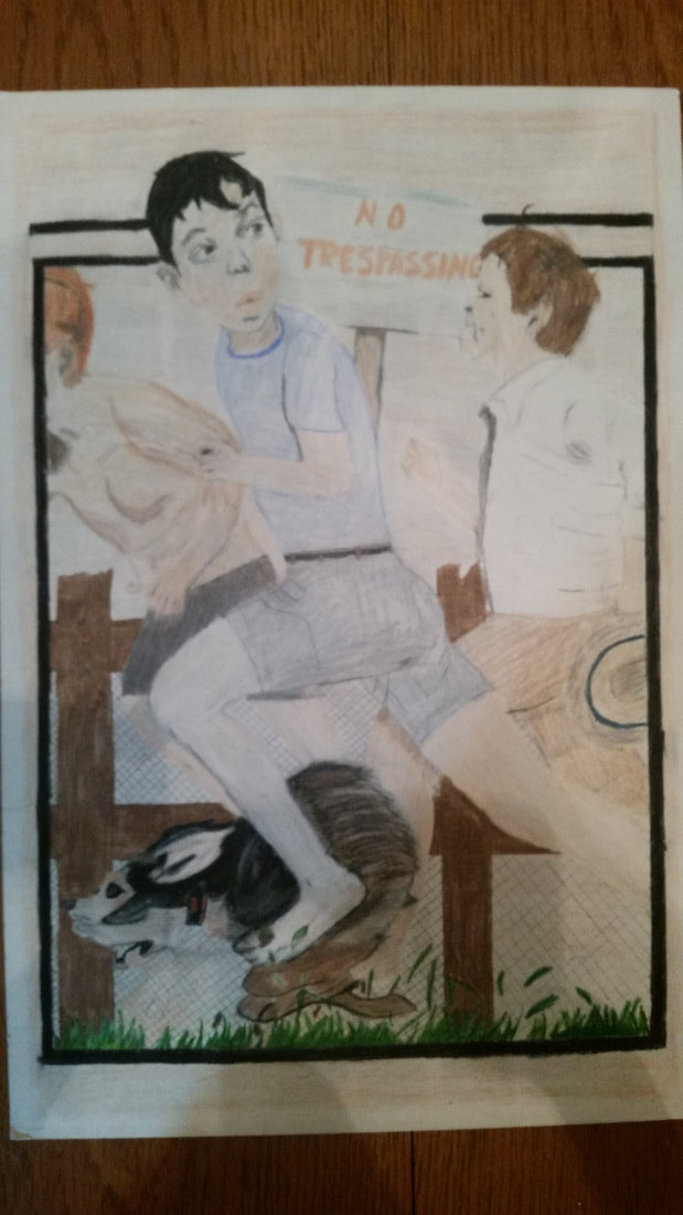
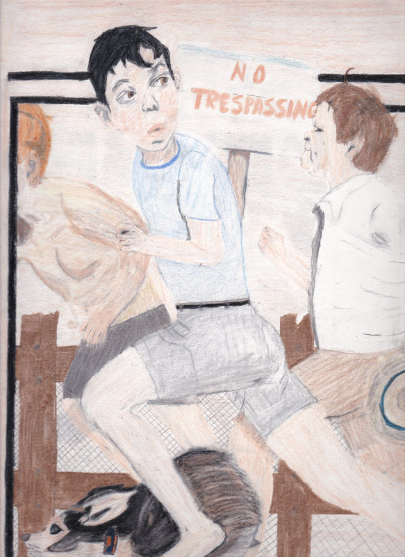
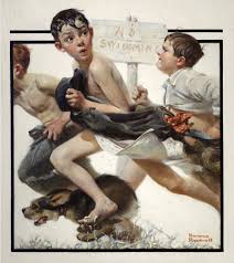
Illustration Board 25.4 x 38.1cm November 2017 (Left is the full picture, but poorer quality. Middle and Right are the top and bottom halves of the piece in higher quality.) Exhibition Text This piece is titled No Trespassing, a play on words of Norman Rockwell's No Swimming. This is meant to be the first in a two part illustration project under a theme of Self-Conflict. This is a positive prelude to the other piece, and portrays a memorable and positive event in the light of this story I have formed. |
(Click to enlarge pictures)
Planning
Inspiration
|
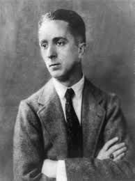
It was very challenging to brainstorm for both pieces of this project. In fact, it was not until 2 weeks before we had our progress check that I had decided on my inspiration for this work. For my positive piece of the two, I had taken a liking to No Swimming by Norman Rockwell, a famous American Illustrationist. I had also taken a look into other artists such as Arthur Rackham and Coles Phillips, but decided against them in favor of Rockwell's higher detail. Seeing how realistic many of Rockwell's pieces inspired me to focus a lot on this and pay more attention to detail than I would have regularly. In this piece, I wanted to I also wanted to take advantage of the fact that we would have two different pieces to try and tell a story that would combine them. I felt like I would be able to branch them together through that story. My theme that I have tried to settle on is Conflict. I wanted to branch off into more of a subtopic of Self-Conflict, depression or alcoholism for example. I had decided on I my idea for the negative piece before this one, which presented a problem for me. How would I be able show the negative effects of depression on someone as their life progresses? In this piece, I decided to make the positive thing be a memorable moment in that person's past, something for them to look back on and smile about.
|
(Click to enlarge pictures)
|
Planning Sketches
|
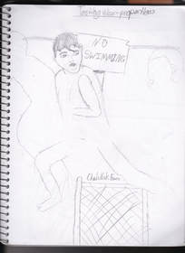
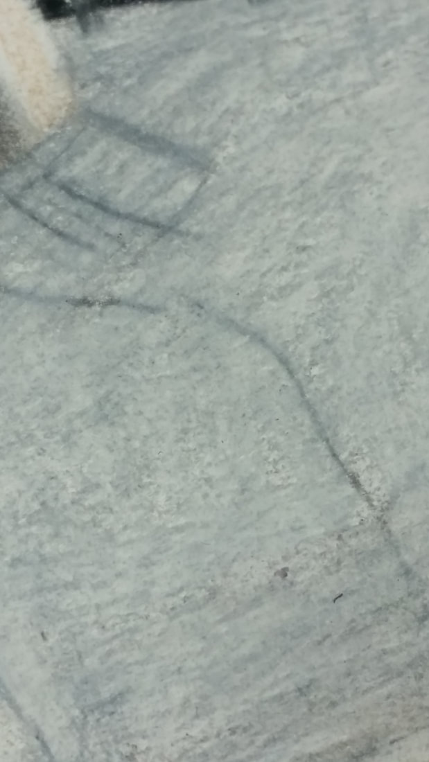
In this first sketch, I just did a (very) rough sketch of some of the art just to get a general feel for it. I did not plan to make it very realistic and just to test out some ideas. I am glad that I at least did this so I had a decent idea of how to do the three running boys. The majority of my planning was done directly onto my board. While that may have not been the best way to do it what so ever, I feel that it had worked out for me. On this page, I had also tested the possibility of using a chain-link fence in the background.
|
|
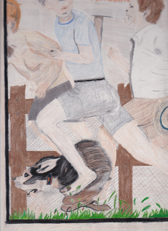
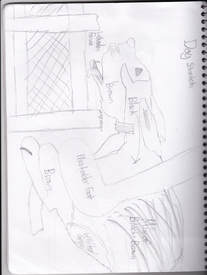
This was probably one of the more helpful sketches that I did for this project. However, I still spent a long time actually creating this dog on the final board. However it is still a rougher sketch as I did not want to waste to much time on these sketches when I could be working on the final product. I do feel that it became much more refined when I actually spent a lot of time on it for the final work. Also on this page, I had wanted to test a wooden fence and chicken wire combination to compare the chain-link fence against.
|
Process
|
Experimentation
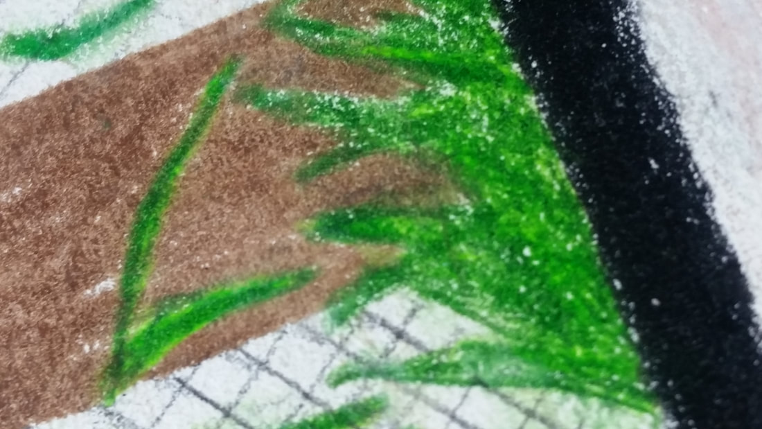
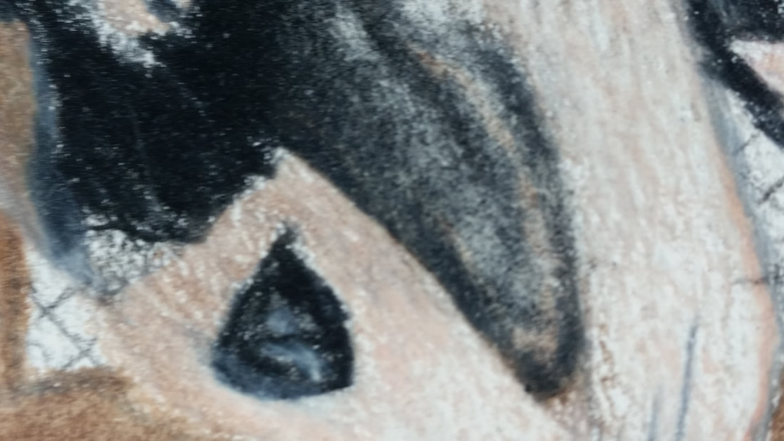
I did experiment quite a lot with this project on many different aspects. The main thing that I had tested was using a white colored pencil to help blend the colors on pretty much everything in this. The parts where this had helped the most was on the skin tones, the clothing, the grass, and the dog. An example of each aspect is shown on the left, from left to right, in respect to the previous list. Another thing that I had experimented on was with using an eraser to lighten certain areas up and put some emphasis on some shaded portions. The aspects that had benefited the most from that technique the dog's behind and the hat that the right most boy is running with. |
|
|
Process
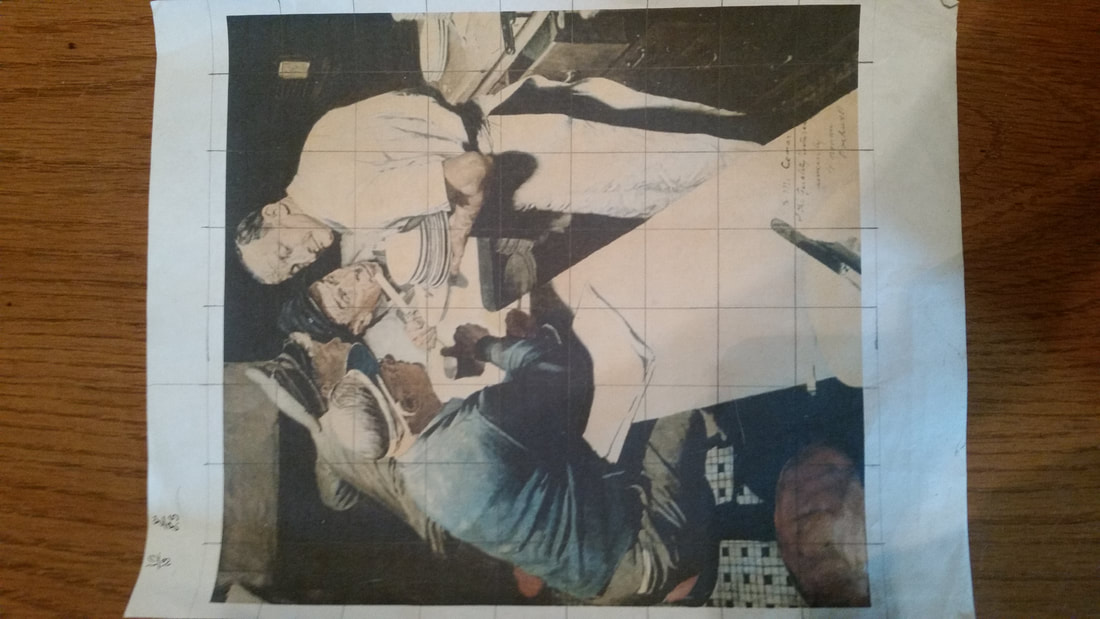
Sketching: After I had finished my minimalist planning sketches, I then printed out a picture of No Swimming and created a grid over it to assist in sketching the entirety of the picture onto the illustration board. This is a method that truly helps me when working on these types of things, as my hands can be very unsteady most of the time. I calculated the difference in the size of the grids, as I could not print out the picture to be the same size as the board. |
Drawing and Coloring: This portion of the process was definitely the most grueling and time consuming part of it all. That was partially due to the fact that we had to change the setting of the original piece to a more modern setting. I think that I was able to execute that in a strong manner and still be able to relate it to the story that I had wanted to tell with these two illustrations. I wanted this to be a prelude to my negative piece, something I could bring into that piece and bridge the gaps between the stories. However, in order to keep it in a more modern context, I could only go back so far. Therefore, I tried to keep it only about 15-20 years in the past, and have the boys only be around 10-12 years old, to keep the ages appropriate to the timeline. A few of the things that I had done to modernize is was, of course, clothe the kids (and keep said clothing modern), change the sign, and just generally update the setting. For the clothing, I just gave the center child a generic shirt, and the right child an updated long sleeve shirt (similar to the one in the original artwork). For the shorts, I gave the right two cargo shorts and the left some generic grey fitness shorts. The sign was more of a last minute decision for me. I had been thinking for days as to what to change it to, but that all changed when I had the idea for a fence in the background. It would further enhance my story; which would be them be them goofing off on private property without their knowledge, and being scared off by the owner, almost being caught. I really felt that this would be a thing that a lot of people can relate to, because be honest, who hasn't done something stupid like that. The aspects that I had decided to keep consistent were the children themselves, the hat that the kid is holding, and the dog. I had thought that making the kids different would be changing the picture a bit too much in my opinion. It also helped me to further tie it into my negative piece, and have it so the kid with the black hair is the left most man in the other piece.
Reflection
This project has definitely been my favorite art project that I have ever done in my life. It pushed me more to actually be much more attentive to detail. On this piece specifically, I did find that the skin tone had been difficult to create well and keep it similar to the same color in the original piece. My personal favorite things that I did on this illustration is the background fence and the dog. The dog was the first thing that I created for this project I feel that I may be the most detailed aspect. I also believe that the fence had turned out very well and that it creates more depth in the art. I overall just really enjoy the concept that I created for the projects as a whole. I think that this has the best correlation to my theme so far.
ACT Responses
1. Clearly explain how you are able to identify the cause-effect relationships between your inspiration and its effect upon your artwork.
Norman Rockwell's art is created with very high amounts of detail, which I tried very hard to do and did to the best of my ability.
2. What is the overall approach the author has regarding the topic of your inspiration?
Rockwell did many different illustrations spanning multiple distinct topics over the years, including Conflict related pieces talking about WW2 or black oppression during the Civil Rights Movement.
3. What kind of generalizations and conclusions have you discovered about people, ideas, cultures, etc. while you researched your inspiration?
Through my research, I discovered that a significant portion (more than I had originally thought) of the world population suffers from mental health issues and alcoholism.
4. What was the central idea or theme around your inspirational research?
The theme that I have been trying to stay with so far this semester in Conflict.
5. What kind of inferences did you make while reading your research?
In the end, I inferred that it doesn't matter who it is, it could be just some random passerby on the street; they could be struggling with diseases like depression and it needs to be taken more seriously.
Bibliography
“The Art of Norman Rockwell - Norman Rockwell Museum - The Home for American Illustration.” Norman Rockwell Museum, www.nrm.org/collections-2/art-norman-rockwell/.
