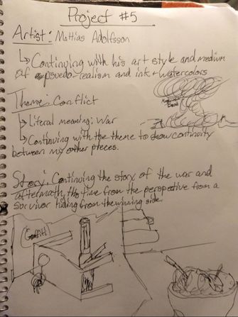
Project #5
|
Hide
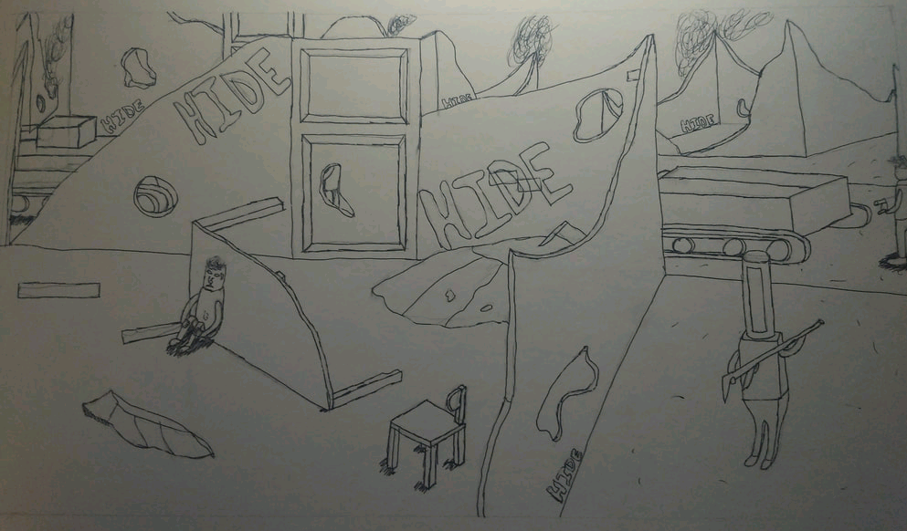
25.4cm x 49.5cm Pen and Watercolor Paint on Illustration Board November 2018 Exhibition Text Hide was inspired by Mattias Adolfsson, a Swedish freelance Illustrator with a unique art style. This piece was made to be satirical towards the idea of war and the destruction of civilian targets caused by war, and the fear that is instilled in those affected. |
(Click to enlarge pictures)
Planning
Inspiration
|
After my previous project, I had some trouble deciding on an idea that would be able to show a sense of continuity with my 2 previous pieces. I was already certain that I wanted to do another project in the same art style as the others. My goal was to, again, create an illustration in the art style of Mattias Adolfsson; a Swedish Illustrator that specializes in ink and watercolor illustrations. As per usual, I planned to use my overall theme of Conflict to tie everything together again, with this time I went back to a more literal version of conflict: war. I was determined to show a new perspective in my story. In my first piece of the series, I had a distant, omnipotent, and third person view of this large battle, without any direct focus on one side. In my second piece, I brought it down to a more personal viewpoint, with a first person view from the eyes of an attacking soldier feeling the consequences of his actions in the fight. For this piece, I wanted to focus more on the other side that had been wiped out, with the few survivors struggling to make their ways to safety. I looked through Adolfsson's works again to find something that could inspire me and give me a plan of action. First, I went back to some of his works for Dance Gavin Dance's album arts, as I wanted to try and make use of the initial inspiration from the first piece in the series. There ended up being nothing of interest for me there, because I wanted there to be a more personal connection with this piece. In the end, the specific works that I ended up taking inspiration from were my own previous works; along with assorted concepts from "Just your Average Generic European City, "Sketchbook April 2016", and "The large Basilica".
|
(Click to enlarge pictures)
|

Planning Sketches
|
This first planning page was made to lay out all of my ideas and concepts for this project. I discussed my idea plan for my theme in this project. As mentioned previously, I planned to work with my theme of conflict and branch off into war again, as I felt that there was more ideas that I would be able to touch on within this story that I have been able to create. I also knew that I wanted to continue with my style and story that I had started to portray. I also had a pretty good idea of what I wanted to go with for this piece. I planned to continue with my satirical form of expression and art style to help convey my ideas on this topic. All of these ideas lead me to take even more inspiration from Mattias Adolfsson. I find his unique art style to fit my ideas rather well, as it tend to over-exaggerate or satirize something, which would work perfectly with my ideas for the characters features, a building, or some of the weaponry within my previous piece. I also wanted to continue with my plans for using ink and watercolor paint as my medium, as the majority of his work is done in that medium. Another plan was to continue along with my story that I began in my previous piece, with the two separate sides fighting, and the left side losing the battle. It then went into my next piece with the aftermath of that battle. The remainder of the page highlights different concepts and drawings from his works listed in the middle. The overall idea that I decided to portray in this piece was to show the destruction of civilian targets caused by this war from the perspective of a survivor fearing for their life and hiding from their attackers.
|

|
This next planning sketch was my main idea on the overall design of this project, and ended up being my final design that I chose to go through with. This idea was as follows: a viewpoint of a 'survivor' from the initial battle in Instant Annihilation in the setting of the my previous piece, I wanted to add more absurd and exaggerated elements within the piece. There were a few things that I definitely needed to make use of. I ended up making more use of Adolfsson's "Just your average generic European City" piece for more inspiration in his style with the buildings. Another definitive aspect that I planned to include was showing this scene through the distant view of an unknown person looking out on this dangerous scene, and showing the fear in the survivor on the left. This piece occurs shortly after my previous one, showing the soldiers and tanks walk through this ravaged society and buildings, searching for any survivors. I also planned to include more details to add to the dark and destroyed environment. One of my final decisions was to have the smoke rising up high into the sky from the destroyed and burnt out buildings to help add to the dreary feeling and show continuity.
|
|
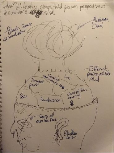
This was my final planning sketch for this project for the overall design of this project. I initially had an idea related to this, although I did not actually sketch it out until after my other idea. I did not go through with this idea, but I definitely still like my idea for it and it definitely could have been a good piece to go through with in the future. The idea for this one is as follows: a large illustration with the close up sectioning of a survivor's mind that shows all of the different feeling that he is enduring. I got the idea from a drawing in one of his sketchbooks, where there is a large head in the same style, but there are bionic-esque designs attached to his brain. I wanted to use that as the base idea, with a few key changes. I liked the height seen with in the original piece, and I gave me the idea to use imagery of a mushroom cloud to show the intensity of the destruction. I then wanted to add scars and injuries to show the physical scarring to him. Along with that, I would show many negative things and parts of his brain removed to show the mental scarring done to him. However, I decided against it in favor of my other concept for this piece.
|
Process
|
Experimentation
There was a decent amount of experimentation that I put into this piece in comparison to my other works in this series. The first major set of experimentation that I went through was with different colors of watercolor paints. I had a large variety of watercolors that I borrowed from a friend: 24 separate colors in total. After inking everything in on the board, I got about to mixing my colors. I wanted to go one color at a time starting with a light green for the left most tank and ending with some light gray color. I also tried to overlap my colors a bit more than I would with my acrylics to help form a bit more depth and shadowing. I would have to say that there was far more experimentation in the coloration of each color for each specific character rather than each individual character/creature throughout the piece. In this piece I again copied a few of the robots and the tanks from my previous piece to get started, in order to show the continuing story and ideas. I had did not have to conceptualize many of the others myself this time around because of that, but I still created a few new ones. This proved to be a less challenging for me, as I had worked with the style of illustrating in my previous piece and I was reusing many of the characters, although they would be in a different position to the original. I stuck with the style of Adolfsson for each of my characters to continue with the lack of realism, making the main character completely random and bizarre. Another bit of experimentation was the coloring of the building and the contrast of the color/design of the graffiti on the walls. There was overall a lot less experimentation for this piece, as I planned to use a lot more of the same aspects from my previous piece. |
|


Process
My first step was to cut the illustration board to the size that I thought would be appropriate for this piece. The original shape of the piece of board was far too square for my ideal shape, which I wanted to be wider and shorter to fit with the shape of fit my ideas of a with this piece. I used a ruler to measure and mark the dimensions that I wanted to cut it to. I then used a large paper slicer to slowly cut along the line and split the board in two. One nice thing about doing it this way was that the board did cut very cleanly this way in comparison to using a box cutter to get rough edges. This also helped to tie into my idea of this being an "official" work from the attackers government to show victory that took place at that time.
After cutting it all to the right size, I got to do a simple and rough sketch of the general shape of the layout in pencil in case I messed up with the pen. I had considered using the square method to assist in recreating the sketching process, but I chose not to because of two reasons. First, I thought that the proportions on my initial sketch were a bit too unrealistic and the dimensions for each sketch would not fit well. Another reason was the simple fact that I wanted to go a bit wild with my planning on the board and not be mentally constrained by my first layout. After deciding this course of action again, I sketched in the main archway in the foreground and set up the lengths and widths of each section of the road. The next sketch was for the vine mural on the front of the entrance, the wooden beams helping to support the massive structure and each of the different windows on both sides of it. I even made the decision to add some detail into the walls by having some of the brick be displaced to add some depth and texture to the façade, instead of just having it be one plain and flat wall. I continued with this architectural route and sketched in each of the separate buildings past the archways that were destroyed, along with the fiery smoke rising off into the sky. After finalizing my design for each of those separate aspects, I then moved onto the characters and tanks themselves. For this aspect, I went and searched for any of the specific characters and tanks that caught my eye in my previous piece to carry onto this piece. There ended up being a very small amount of new characters that I would actually need to create. The characters that I ended up having to create were the left green tank, a few of the distant humans, the leader that is projected atop the archway, and the arms of the soldier's perspective. One of the last things that I chose to do in this part was remove my initial plan to have the soldier dropping his weapon and adding the blood to his arms. I chose to remove the weapon for two reasons: I felt that adding the blood would have a greater significance to the mood, and I just could not get the weapon to look very good in this perspective.
After finishing the overall sketch in pencil, I got into inking each and every aspect throughout this entire piece with my fine point pen. This process went by rather quickly, as I already had my overall design mostly finalized and didn't need to add much of anything. I started with the each of the tanks, adding a bit of detail to the tracks and the plating itself to improve their looks. From there, I went along with each of the designs for the characters and did not change them, because I was satisfied with their initial outcome from the sketch. The characters themselves took a bit more time again, just to ensure a that there would be no accidents that could harm the overall look of the piece. After finishing that part, I went through each separate part of the buildings, only adding a few extra bricks to the façade where I felt was necessary, and some extra detail to the destroyed buildings in the background. I then simply finished inking the rough shape of the smoke from the buildings and adding the shadows where ever I could apply them.
From there, I got into my watercolor paints and started experimenting with a few different colors before actually applying it to the final product itself. My major worry was having similar colors for the buildings, archway, and roads. For most of them, I started with a base tan color and then adapted that specific color to differentiate each of the separate aspects in the piece. I followed a similar pattern to my inking pattern, just doing it backwards this time around, starting with my tanks and the characters first. I then moved onto the smaller parts of each building one by one, such as the bricks and the windows. I did try to keep a general color scheme for both the characters and the buildings to help define the difference in each side. After finishing the ground and the buildings, I moved onto the smoke and the sky color, applying the fiery color at first, and then going over it with the main color. At that point, I went through to check for any mistakes in shadowing and missing colors, officially finishing the piece.
Reflection
Overall, this would have to be one of my overall favorite works that I have created in this series. I genuinely enjoy illustrations in general and also Adolfsson's art style in particular. I am glad that I stayed with this artistic medium for the rest of my works in this semester. I will definitely use this medium to make works again if I ever wanted to make more. One thing that I am rather pleased with is my detail with the pen ink on most of the aspects throughout the piece. I also feel that I created a strong feeling of unbalance that I think helped tie together my goal of showing the fear within this love survivor. I am again happy to be using the watercolors and I feel that it all turned out close to the way I had envisioned. I also like the way that I cut it in comparison to how it was in the first piece.
ACT Responses
1. Clearly explain how you are able to identify the cause-effect relationships between your inspiration and its effect upon your artwork.
Mattias Adolfsson has a very unique art style with his illustrations, which I mimicked throughout this entire piece. I also followed the mediums that he works in, using pen ink and watercolor paints to form these interesting artworks.
2. What is the overall approach the author has regarding the topic of your inspiration?
While Adolfsson does not make anything abundantly clear on his views on my topic. I feel that he would feel similarly to myself because of the way that he portrays some his designs.
3. What kind of generalizations and conclusions have you discovered about people, ideas, cultures, etc. while you researched your inspiration?
Throughout the scope of my research, I came to the conclusion that some war are truly pointless, with one side just being able to unnecessarily obliterate the other for done real reason other than just general disagreements.
4. What was the central idea or theme around your inspirational research?
The theme that I have been trying to stay with throughout my work is Conflict, with this piece branching off into the more literal idea of conflict: War and its futility.
5. What kind of inferences did you make while reading your research?
Overall, I inferred that war can be more complicated than most people realize, but I still feel that it is rather unnecessary if we are to come together as a people like so many desire.
